SCHEDULE YOUR COMPLIMENTARY CONSULTATION

SCHEDULE YOUR CONSULTATION

"*" indicates required fields

This field is for validation purposes and should be left unchanged.
Optin

"*" indicates required fields

This field is for validation purposes and should be left unchanged.
Optin
If You Love Blue, Here Are Some Stunning Ideas to Use Blue in Your Home’s Design

If You Love Blue, Here Are Some Stunning Ideas to Use Blue in Your Home’s Design

Blue and White Two Toned Kitchen Renovation With Open Concept Layout

When it comes to overall popularity, the color blue reigns supreme, so here are some stunning ideas to incorporate the color blue into your home’s design or a remodeling project.

Why People Are Drawn to Blue in Home Design

Cool colors - blue

There isn’t a single color more popular in the world than blue. Its popularity extends to every country and demographic. But why? What does blue represent?

The color blue is closely associated with feelings of calmness or serenity. It is often described as peaceful, tranquil, secure, and orderly. People have also been shown to be more productive in the presence of blue and it can also boost creativity.

Conversely, blue can create feelings of sadness or aloofness. It is also one of the least appetizing colors on the spectrum, and foods that turn blue are typically spoiled. But despite the few negatives, blue remains universally the most popular color. Because of its broad appeal, it is often considered a non-polarizing color.

People who like the color blue share similar character traits. They can be more dependable, trustworthy, gentle, compassionate, peaceful, and strong.

It is not hard to see why blue is a popular color in home design and remodeling. After all, when you think about what you want to feel in your home, what can be better than feeling peaceful and serene? This is exactly why our customers and designers love to use blue. Here are a few of the most beautiful and stunning ways to incorporate the world’s favorite color into your home.

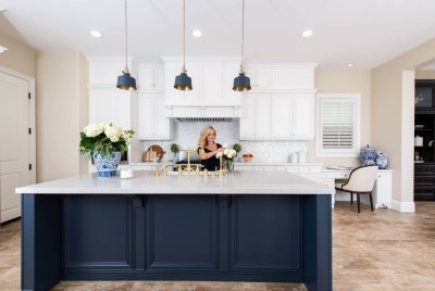
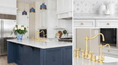
This Classic Blue Island and Hood Steal the Spotlight

San Clemente Blue Kitchen Trends of 2020

This traditional kitchen on its own is a beautiful work of art, but when you ground the entire design by this classic blue island with custom blue hood designed by Sea Pointe, the entire aesthetic transforms into pure sophistication.

While this kitchen has plenty of stunning details, the classic blue really pops and steals the stage. You can see the blue door in the dining area also peeks out and grabs you;.  Blue tends to be timeless and a color favored in home design.

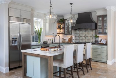
More Stunning Blue Stoves and Design Ideas

Kitchen remodel in Aliso Viejo uses Blue

More blue design lovers – you note folks typically are using their blue as features and not the entire set of custom cabinetry.  This kitchen design does it just right as an accent with only the island in blue. It gives your eye a place to go when you walk in the room which is comforting to your mind cerebrally as though nothing is competing and it’s an easy decision where to look.  This simplices your cognitive function and is also pleasing as a calming agent when you design to reduce distractions; too much stimuli sends your brains in circles, tiring it while not getting anywhere.  Be sure your color is used right and not overwhelming.

Incorporating Blue in Subtle Ways Within Tile and Stone Designs

Kitchen renovation in Dana Point with Bedrosians Quartzite Leblon island countertop

Using subtle pops of blue in this backsplash tile and in the veining on this gorgeous quartzite countertop provide moments of calm and tranquility combined with old-world charm. The blue in both treatments mixed with the shades of taupe compliment and balance each other perfectly.

When it Comes to Designing with Blue – Go Big!

Newly-installed-shower-niche-and-shower-bench-in-master-bathroom-remodel

When subtle pops of color are not enough and you want to experience an immersion of blue design, it’s important to be bold but not overbearing. This gorgeous bath features vanity cabinetry designed with a custom blue paint color specifically picked out by the homeowner to complement the stunning blue shower tile inspired by a fish scale design. Not to mention the very on-trend flooring used in this design.  Just search #geometric and you will see how on-trend this tile design in.  This fun, coastal design shows off just how close this home is to the beach.

Shiplap wall behind blue double vanity in Aliso Viejo bathroom remodel

This bath remodel uses blue subtly in its’ modern farmhouse design.  The clients also chose to go with mixed metals so they could get the farmhouse vibe with plumbing fixtures while getting the gold glam on the understated blue double vanity. The alternate side of this master bath is a white wet room, making this blue pop, just that much more! 

Incorporating Blue Design That Compliments Your View When You Actually Live at the Beach

At first glance, this seaside kitchen doesn’t appear to be using a lot of blue in the design. But, what it does perfectly is use the sparkly blue pops in the backsplash to compliment the breathtaking sparkling water views. After all, there is simply no competing with the crystal blue water views. However, this backsplash and pops of blue behind the textured glass transition seamlessly with the ocean.

Simple Blue Tranquility In a Bathroom

Serene blue in bathroom remodel

Painting a wall is a simple idea. But, the brilliance of this simplicity is that the blue on the walls of this bathroom helps the space feel calmer, more tranquil, and helps to make this long narrow space feel more expansive and open. Relaxing and soaking in a beautiful free-standing tub surrounded by the color of the sky helps the homeowner forget the stress of the day.

Designing Spaces for People Who Love Blue

Bold-Blue-kitchen-design

Using blue in your home’s remodel and design can help your home feel more peaceful and serene. This is exactly why our customers and our designers love to use blue. If you’re ready to start planning your own blue-inspired renovation, give us a call at (949) 861-3400 or fill out the form below to schedule your complimentary design consultation.

Let's Discuss Your Next Project!

"*" indicates required fields

This field is for validation purposes and should be left unchanged.
Name*
Project Type
Text Checkbox*

We guarantee 100% privacy for all information!

If You Love Blue, Here Are Some Stunning Ideas to Use Blue in Your Home’s Design was last modified: December 18th, 2025 by Smart Marketing
Cool Colors and the Power to Encourage Growth, Peace, and Spirituality

Cool Colors and the Power to Encourage Growth, Peace, and Spirituality

Color Psychology - Cool Colors

If you love the colors of the ocean, the mist over a purple mountaintop, and the peaceful green hues of nature, you might be drawn to the coolest colors on the spectrum; green, blue, and purple. But how do these cool colors really make us feel, and what types of people are drawn to them?


Green the Color of Growth

Cool colors - green

Green is created by mixing yellow and blue, so it combines the emotions of peace and happiness to promote healing and growth. It is the most prevalent color in nature and symbolizes life, health, and new beginnings.

People who like green are calm, analytic, and visionaries. They can seem antisocial, but really, they are independent. They adapt quickly to new situations and can quickly grasp groundbreaking ideas and abstract concepts. They are generous partners, and their relationships are built upon respect and loyalty.

Being prevalent in nature, it is not surprising that green is regarded as the most natural, restful, and relaxing color to the human eye. In the proper shades, green can calm and focus you, in fact, it has been known to lower the levels of hypertension and blood pressure.

So how might green impact your home’s design?

  • In your home bathroom, lighter shades of green can promote rest and relaxation and help you feel more refreshed as you get ready in the morning or unwind after a long day.
  • In your bedroom, the right shades of green can make your bedroom a calm and rejuvenating oasis. It can reduce anxiety and lower your blood pressure – conditions ideal to help you get the best sleep possible.
  • In your home office, this is where green really shines. Green inspires growth and security in a calm and relaxing environment. Using green in your home office will help foster innovative ideas and concepts while reducing anxiety.

In the right shades, green is perfect as an accent wall or design element and helps you feel safe and secure in your home.

Blue the Color of Peace

Cool colors - blue

As a primary color (and the most popular color on the spectrum), blue is a building block for many other colors and shades, but in its purest form, blue represents peace and tranquility. That’s because blue is synonymous with such things as the daytime sky on a calm day.

Blue is non-confrontational. It is the only color that has an array of positive effects, and little to no negative effects on the psyche. Some of the descriptions for the color blue include calmness and serenity but it also evokes orderliness. In fact, blue has been shown to increase productivity due to its calming and mentally stimulating effects. The use of blue is associated with trust and dependability and may be why it is the color of choice for uniforms for law enforcement and for authority figures.

People who like blue are confident, loyal, calm. They are good listeners and great friends, and as such, form strong, deep relationships. They demonstrate creativity, work well with others, and are good communicators.

It is not surprising that globally blue is considered to be the most popular color. In fact, out of all the colors, blue is by far considered the most trustworthy one. In fact, studies have shown that people are 15 percent more likely to go to stores that are painted in a hue such as blue, as the color suggests loyalty and reliability.

Color Psychology - Cool Colors

So how might blue impact your home’s design?

  • In your home kitchen, blue is wonderful for kitchens. In most homes, the kitchen becomes the gathering place where friends mingle and connect and blue helps to relax people and promote trustworthy conversations.
  • In baths, in the right shade, blue can make small, dark places seem lighter and more open. It can also be used in your bath to promote relaxation after a long, hectic day.
  • In your work area or kid’s playroom, this is where blue can really shine. It helps to induce serenity and clarity, and increase productivity.

Blue can be an incredibly sophisticated design element when used as an accent color such as beige or white.

Purple the Color of Spirituality

cool colors - purple

Known as one of the rarest colors, this year’s Pantone Color of the Year is in fact a shade of purple! Purple is created by mixing the cool color blue and the warm color red. As such, it somehow impossibly combines the emotions of passion and peace to evoke spirituality. Further adding to the mystique of purple, it represents the colors that are the rarest occurring in nature.

And because it is strong and powerful like red, but orderly and trustworthy like blue, it makes absolutely perfect sense that darker shades of purple evoke royalty and nobility. It is not surprising that purple is considered to be one of the most regal, elegant, and royal colors. But due to its scarcity to occur naturally, it is also considered to be the most spiritual color on the spectrum and the darker shades create mystery and inspire curiosity.

People who like purple are charismatic and compassionate. Like their red counterparts, they have a certain power and like their blue counterparts, they also have stability. In other words, they have the perfect countenance to rule or lead others.

So how might purple impact your home’s design? It is actually one of the colors most impacted by varying shades.

  • In your bedroom, lighter shades of purple shift towards feminine or romantic energies and mystery, and may help induce dreamlike feelings – perfect for the bedroom.
  • In your teen’s work area, hang-out room, purple inspires creativity, so it is perfect for in-house art studios. It is a hit with adolescent teens and inspires them towards creativity.
  • In your entertainment area, this is where dark purple really shines. It conveys majesty, elegance, and richness in a calm and serene setting.

Purple is perfect as a design element for an accent color and dark purple pairs very well with gold.

You’ll love: 4 Timeless Kitchen Cabinet Colors

Let's Discuss Your Next Project!

  • This field is for validation purposes and should be left unchanged.
  • We guarantee 100% privacy for all information!


Cool Colors and the Power to Encourage Growth, Peace, and Spirituality was last modified: December 18th, 2025 by Smart Marketing
Warm Colors and the Power to Inspire Passion, Optimism, and Happiness

Warm Colors and the Power to Inspire Passion, Optimism, and Happiness

warm colors on the color wheel

If you love the fall, looking into a roaring fire, and the warm glow of sunshine, you might be drawn to the warmest colors on the spectrum; red, orange, and yellow. But how do these warmer colors really make us feel, and what types of people are drawn to them?


Red – The Color of Passion

warm colors - red

There are only three primary colors on the spectrum, blue, yellow, and red. Of the three, the most dramatic standout is red. In fact, of all the colors, red provokes the strongest emotions, and it is this level of drama that can trigger the opposing and powerful emotions of passion and love as well as anger and danger.

People who like red are often extroverted, open, enthusiastic. They live their life to the fullest and can be quite competitive. It is not surprising that red is considered to be a powerful color. Red can increase a person’s heart rate and make them excited.

So how might red impact your home’s design?

  • In your home office, red stimulates leadership, willpower, high energy levels, and friendship. It can keep you energized and focused to take on your workload.
  • In your living room, red inspires friendship and stimulates conversation. Use red in your living areas to promote and encourage camaraderie.
  • In your bedroom is where red really shines. It ignites desire and passion and stirs and inspires feelings of love.

Red is perfect when you want to draw attention to a design element or use it as an accent color. Use red too much and it can be overwhelming.


Color Psychology - warm colors


Orange – The Color Of Optimism

warm colors - orange

Orange is created by mixing yellow and red, so it combines the emotions of passion and happiness to evoke undeniable optimism and enthusiasm. It is strong like red, but not powerful. Instead, orange helps us feel cheerful and energized, inviting and friendly, and ready to take on the world.

People who like orange are social, optimistic, and even a little forceful. They need to be around others and enjoy being accepted into and part of a social group.

It is not surprising that orange is considered to be one of the most vibrant colors. Orange can lift you up emotionally and even a small object in orange (such as a mug or figurine) can help you from sinking into grief or disappointment.

So how might orange impact your home’s design?

  • In your home kitchen, orange can instill happiness and even stimulate appetite. It is a great color to use as accents and in “moments” in the kitchen and can help you remain enthusiastic and optimistic even as you multitask.
  • In your living room, orange inspires socialization and promotes friendship. The cheeriness will help any party atmosphere stay lively and warm.
  • In your exercise room or work area, this is where orange really shines. It helps to motivate and energize you, and stimulate you to keep moving.

Orange is perfect as a design element or an accent color and pairs very well with neutral shades.

Yellow – The Color of Happiness

warm colors - yellow

As a primary color, yellow is a building block for many other colors and shades, but in its purest form, yellow represents undeniable happiness. That’s because yellow is synonymous with the world’s most powerful source of happiness – the sun.

Yellow is associated with laughter, hope, and sunshine but it also evokes intelligence. In fact, yellow has been shown to enhance brain activity, heightened mental awareness, and increased mental acuity. Like it’s close cousin orange, yellow promotes optimism and cheer. The use of yellow helps you feel happy and light, but too much of it can be blinding and overstimulating.

People who like yellow are confident, optimistic, cheerful. They are good communicators and they make friends easily. They are loved by others because of their fun personality.

It is not surprising that yellow is considered to be the brightest of colors. Yellow can inspire and motivate us and help spread good cheer and happiness.

So how might yellow impact your home’s design?

  • In your home kitchen, yellow is perfect for kitchens. It inspires creativity, happiness and helps stimulate the appetite.
  • In hallways and baths, yellow can make small, dark places seem lighter, brighter and more open. It can also be used in your bath in smaller amounts to help you feel uplifted and inspired as you prepare for the day.
  • In your work area or office, this is where yellow can really shine. It helps to stimulate creativity, enhance brain activity, and increase mental acuity.

Yellow can be an incredibly sophisticated design element when used as an accent color with grey or white.

Let's Discuss Your Next Project!

  • This field is for validation purposes and should be left unchanged.
  • We guarantee 100% privacy for all information!


Warm Colors and the Power to Inspire Passion, Optimism, and Happiness was last modified: December 18th, 2025 by Smart Marketing
How To Use Color Psychology To Improve Your Home Design

How To Use Color Psychology To Improve Your Home Design

The Psychology of Color in Home Design

Many of us know intuitively that colors affect our mood and emotions. But did you know, how you incorporate colors in your home’s design can make an emotional impact too? That is why we will be introducing a series on the impact of color psychology in home design and remodeling.

After all, colors can evoke a wide range of emotions. Even though you may have a favorite, how colors influence our emotional wellbeing can be universal. Whether it is your favorite color or not.

When guests wait to go on talk shows and TV appearances, they wait in a “Green Room.” The simple reason? The color green can calm and focus you. In fact, it has been known to lower the levels of hypertension and blood pressure. In a study to determine pediatric patient room color preferences of healthy children vs. pediatric patients, it was found that pediatric patients preferred the color yellow – the color of happiness and optimism. Adult color research has shown that people tend to universally prefer the color green; now that’s pretty interesting considering what we’ve already learned about the color green.

Color Psychology of Wall Colors

While wall colors can make a big impact on your psychological preferences and well-being, even small pops of color can also alter your mental state. A sign in red will most likely cause you to stop in your tracks and take heed of the message (or warning). A study found that placebo drugs that were red, yellow, and orange were associated with a stimulant effect, while blue and green were related to a tranquilizing effect. In this study, colors affected the perceived action of a drug and even seemed to influence the effectiveness of the drug.

Pops of color in design can also have surprisingly emotional and psychological impact.  So, when deciding upon materials, design ideas, and color palettes for your home’s remodel, it is important to understand not only which colors you love the most and why, but also how color choices may impact your mood, behavior, and the space itself.

Over the next few weeks, we will be writing about all of the colors of the rainbow. We’ll start by looking at the coolest colors, which are more commonly used in home design:

  • Green
  • Blue
  • Purple
Then delve into the warmer colors:
  • Red
  • Orange
  • Yellow
 And then finally discuss:
  • Black
  • White
  • Brown

We will explore how these colors make you feel, the personality traits of people who like these colors, and how these colors can be best used when remodeling and designing your home.

When it comes to design and remodel choices, materials, craftsmanship, and style are definitely important – but when it comes to emotion – color psychology is key.

If you’re ready to get started on our first color, blue, let’s jump right in and see how folks use the color classic blue in home design and what this means to their psyche while lounging with blue. 

Cool colors - blue for home design

Start reading more about blue in home design now.>>

Let's Discuss Your Next Project!

  • This field is for validation purposes and should be left unchanged.
  • We guarantee 100% privacy for all information!


How To Use Color Psychology To Improve Your Home Design was last modified: December 18th, 2025 by Smart Marketing
Kitchen Hardware Design Styles For 2022

Kitchen Hardware Design Styles For 2022

Kitchen Remodel With White Cabinetry on Perimeter and Island


Kitchen hardware design may be a small part of any kitchen remodel, but it can play a big role in the overall look or style. In fact, it’s tiny details like the hardware that tie the other design elements together to create a finished, aesthetically pleasing and functional room.


What does kitchen hardware design in 2022 look like?


For the new year, you can expect to see kitchen hardware styles that fit with the kitchen trends for 2022: simple, functional, and environmentally friendly. Let’s take a look at a few of the most popular designs.


7 Trending Kitchen Hardware Design Styles


Touch-to-Open Cabinets and Drawers


The minimalist movement featured in so many home renovations today centers around maximizing the use of space but keeping extraneous details to a minimum. For some, that means no kitchen hardware at all.

Instead, you can choose touch-to-open cabinets and drawers. Without handles and door pulls to distract, other materials or design elements throughout the kitchen can be brought to the forefront. And, the smooth, bump-free surfaces that result from no kitchen hardware are the perfect addition to any aging in place design.


Hidden Kitchen Hardware


kitchen-island-makes-cleanup-easy


If you’re wanting a minimalist look but still like the idea of traditional kitchen hardware, you can choose knobs and handles that blend with the cabinet colors and style. They won’t stand out but they’ll still provide you with all the functions you need.


Wooden Cabinet Hardware


Kitchen hardware has traditionally been made from metallic or ceramic materials. However, with an increased focus on eco-friendly kitchens and returning to nature, nature-inspired materials such as wood are becoming popular for kitchen design elements. That includes wooden door pulls and handles for cabinets and drawers.


Brass or Gold Elegance


Caesarstone Quartz Countertop in Kitchen Remodel


Brass and gold continue to be popular choices for kitchen hardware in 2022. Their ability to add a touch of softness but also luxury makes them a beautiful solution for anyone looking for simple elegance that makes a statement.


Eclectic Mix


Today’s modern farmhouse kitchen is the perfect example of combining old with new. If you want to mix traditional features with modern design styles, kitchen hardware can be a great way to do it. When done well, you’re left with an aesthetically pleasing and functional kitchen with hints of the past.


Colorful Contrasts


Kitchen cabinets make a statement and colors pop when you incorporate contrasting colors in your kitchen design. For example, dark pulls on white cabinets or gold handles on dark cabinets make a beautiful color combination and enhance the entire room.


Geometric Hardware Designs


Whether you’re following the backsplash trends of 2022 with a geometric style backsplash or you simply want to add a point of interest, geometric shaped hardware is in. Just be sure that utilizing it is in keeping with your overall kitchen design.


Kitchen Remodeling in Orange County


Are you ready to get your 2022 remodeling goals off to a great start? If so, Sea Pointe Design & Remodel is ready to be your partner! We’ve been helping Orange County residents with kitchen, bath, and whole-home remodels for over 30 years and look forward to helping you with yours. Simply give us a call at (949) 861-3400 or fill out the form below to schedule your complimentary design consultation.

Let's Discuss Your Next Project!

  • This field is for validation purposes and should be left unchanged.
  • We guarantee 100% privacy for all information!


Kitchen Hardware Design Styles For 2022 was last modified: December 11th, 2025 by Smart Marketing